
There are some pretty nice interesting creatures in this game, as I have previously said. The small guys were nice, but I think the big ones are even better.
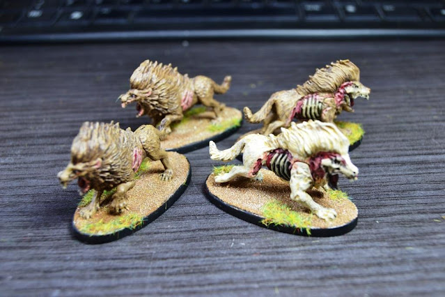
For the Barghest pack leader, I didn't make any conversion. I thought that an albino zombie wolf would be suffciently representative :D
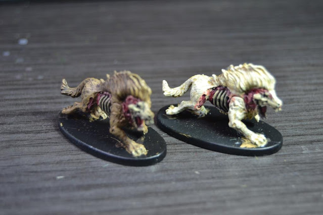 |
| Tried brown on the others rather than black, I'm trying to make the difference! :D |
 |
| If you ever see this, you better run! |
I find the Merriod quite a disturbing creature, and that makes it great. An evolution of the D&D Bulette, I guess. I used greys for the ordinary one, but I didn't want to repeat the albino theme again to make a difference for the leader. Yeah, it would have made sense, the white shark and all that, but I tried just the opposite, I went to a darker palette:
 |
| 'Jaws' OST sounding now |
The Elementals are interesting creatures too. I was used to see Earth Elementals, Water Elementals, etc., but this one is a mega-combo Elemental! All four elements combined. The mini is built in a way that doesn't allow almost any conversions, so I had to improvise. I added a couple of extra air swirls to the tail and sculpted some kind of rough face, nothing bur a couple of eyes in the rock, trying to keep the feral aspect of a beast.
 |
| Besides, I had this little stone from a local park :) |
I toyed with the idea of a horned beast, something like a Balrog, but on
a second thought, it wouldn't fit the idea of an Elemental, I believe.
Or at least may be out of place with this mini.
 |
| I'm hungryyyy |
I'm still finishing the other two type of creatures I have left, I'm quite confident they will be over here after the weekend ;)
Gran trabajo! El merriod es como poco... inquietante.
ReplyDeleteQue maravilla, un descent con minis pintadas, tengo rato de no poder jugar con minis sin pintar, eso ya no me cuela, felicitaciones a jugar como debe ser
ReplyDelete¡Muchas gracias! No es nada del otro mundo, pero aun así es gratificante verlas pintadas :)
ReplyDeleteVery nice and appropriate shade of flesh on the exposed ribcage ... unless you are a painter you just don't realise how difficult it is sometimes to get the shade of pink/red correct. People don't pay attention when it looks normal but complain when it looks a bit 'off'. :)
ReplyDeleteYou are totally right! I sometimes find it difficult to get the right point in details like those, but well, just like everything, this is practise, practise and more practise!
Delete